


Covered Calls: MSFT vs. IREN
Bollinger Bands show everything's momentum in a bull market


Setting the Table:
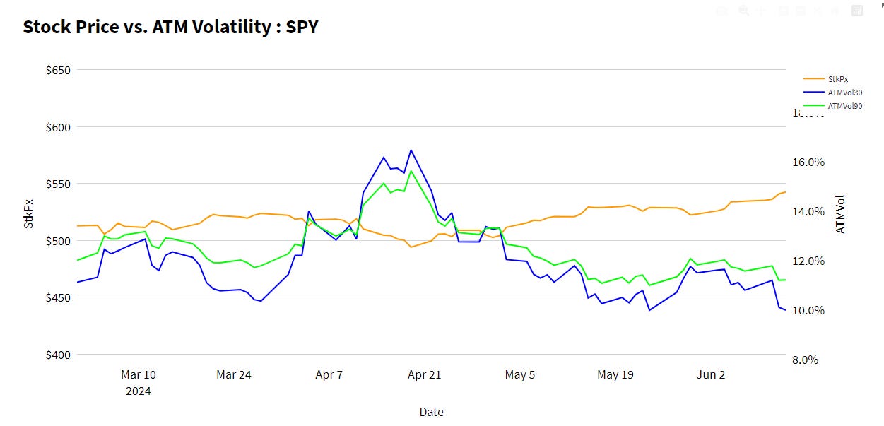
The market is sitting at all time highs and we’re headed into a broken up holiday week. There’s no better recipe for a standstill in volatility markets.
Thirty day ATM vol is testing the lower limits with a slow steady grind higher in the underlying.

The weekly straddle is $45 and the one day is only $18. We’re not expecting much today.
This week our lens will be momentum and mean reversion trades. As much as the volatility analytics tell us about options prices, most opportunities for covered call and hedged equity traders are about wrapping the underlying in an optimized exposure, and direction matters here.
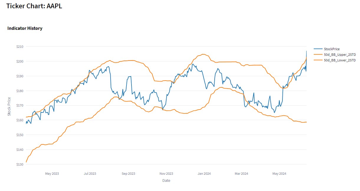
The simplest way to define momentum (or lack thereof) is using the statistical techniques of Bollinger Bands. While often used by technical analysts to draw support, resistance or breakout lines, I prefer to simply think about them as the relationship between current price and its recent history.
The other good thing about a Bollinger band, is that it’s normalized by volatility levels - volatile stocks will have wide standard deviations, and thus need more dollars of movement to hit their respective bands.
At TheTape.Report, we turn Bollinger Bands into a single figure that is the current price relative to the band in question (20, 50, 100 day moving average at 1 or 2 standard deviations). A reading of 100 is right at the band upper band, and -50 would mean the current stock price is halfway between its moving average and the lower band.

The choice of Bollinger Band moving average is a personal one. Longer averages (200 DMA is common) are used to identify longer term trends, and the resulting trade will also be a longer term position. Trade planning for shorter terms should reflect that also, with tighter stops and expecting less time to materialize.
The same theory goes for choosing one or two standard deviations - are we looking for early trends or ones that are really hitting extremes?
As with all of our screens, the momentum or mean reversion lens is only the first filter. Whether you’re looking for a trade or an investment, other pricing factors related to the underlying or relative volatility level should be considered.
Here we’re going to contextualize the Bollinger band levels with the COVC30 reading for an overlay, the ATMVol30 and VRP_CC_30, and IVNetHV30 for volatility levels. We’ve filtered by LIQ250 only, and include ADV and DivYield also for context.
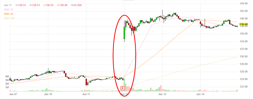
Yikes: ORCL
ORCL pops up on the screen here today with a reading of 332 on the Bolly100STD1, meaning its current price is 3.32 standard deviations above the 100 day moving average.
That sounds like a lot and it is, but it’s worth being wary of the path that it took to get here. We had a big earnings pop, and stock leveled out for three days afterwards.

Even a longer term indicator like the 100 day moving average can get spooked by short term moves.
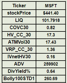
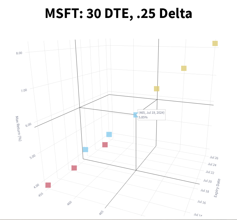
Investment: MSFT
Given overall market dynamics, it’s not surprising to see many high quality names and even indices in this screen. In the top 25 results, we not only have ORCL and AAPL after their big moves, but NDX/QQQ are there, as is SPY. We’re in a bull market baby!
MSFT jumps out here because it’s not quite like all the other names, in that there are some pretty small volatility differences, and relatively high liquidity.

If we dig further into the LIQ score, we see that it’s not volume driven. Combine relatively tight VRP pricing, and current IV matching HV, and we can assume options here are going to be fairly priced.

The prices of the covered calls have been going down at 30 days, as volatility here and in the overall market have trended down.

Since covered calls do as well on the stock movement as they do with premiums, consider the max total return from the various strike selection options. While these 30 day options are offering less than 1% premium, in the 25/30 delta range there is still up to 5.85% upside.


Keep reading with a 7-day free trial
Subscribe to Portfolio Design with TheTape to keep reading this post and get 7 days of free access to the full post archives.